How should Canvas be expressed on a tablet? How can you improve or add onto its functionalities?
The Challenge
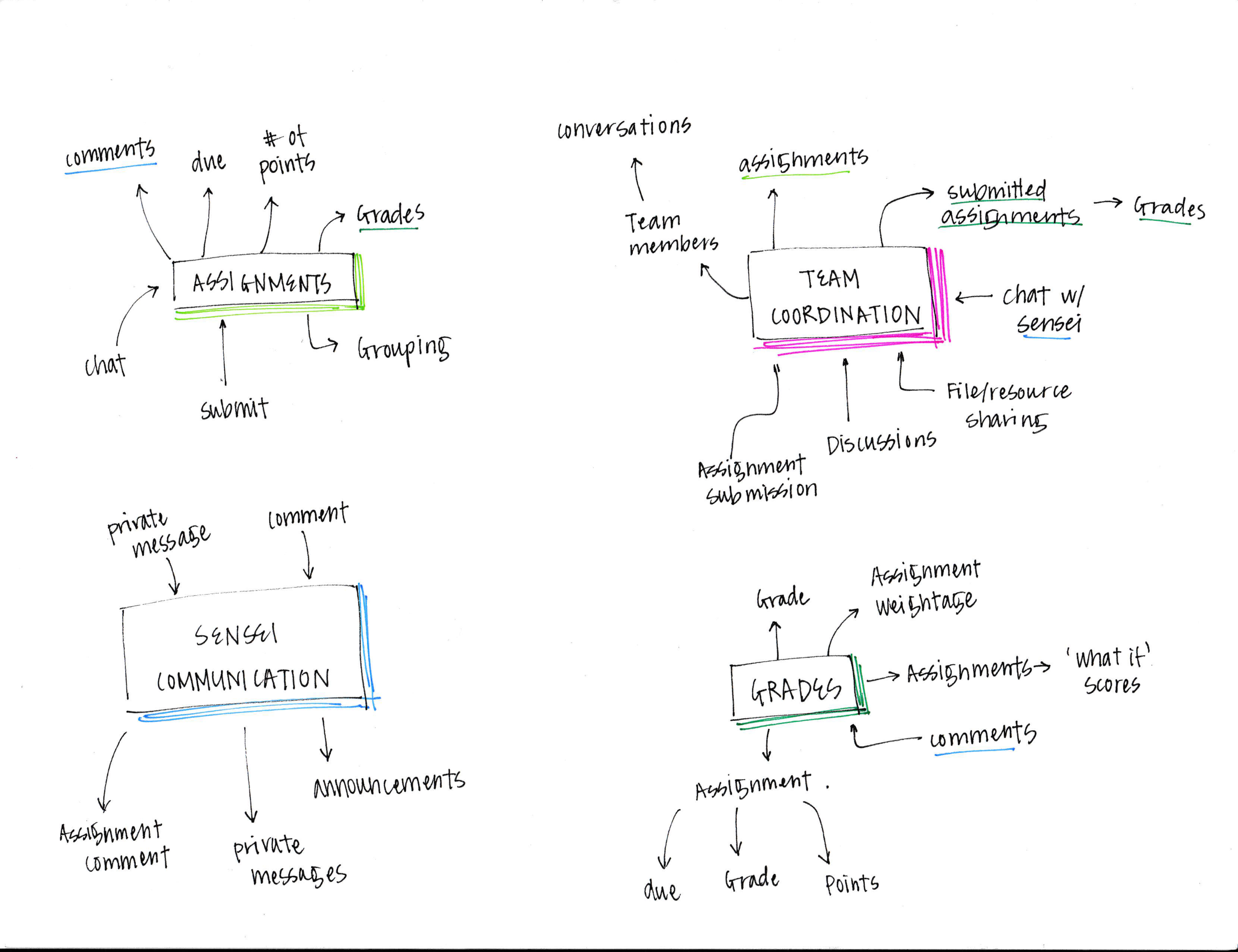
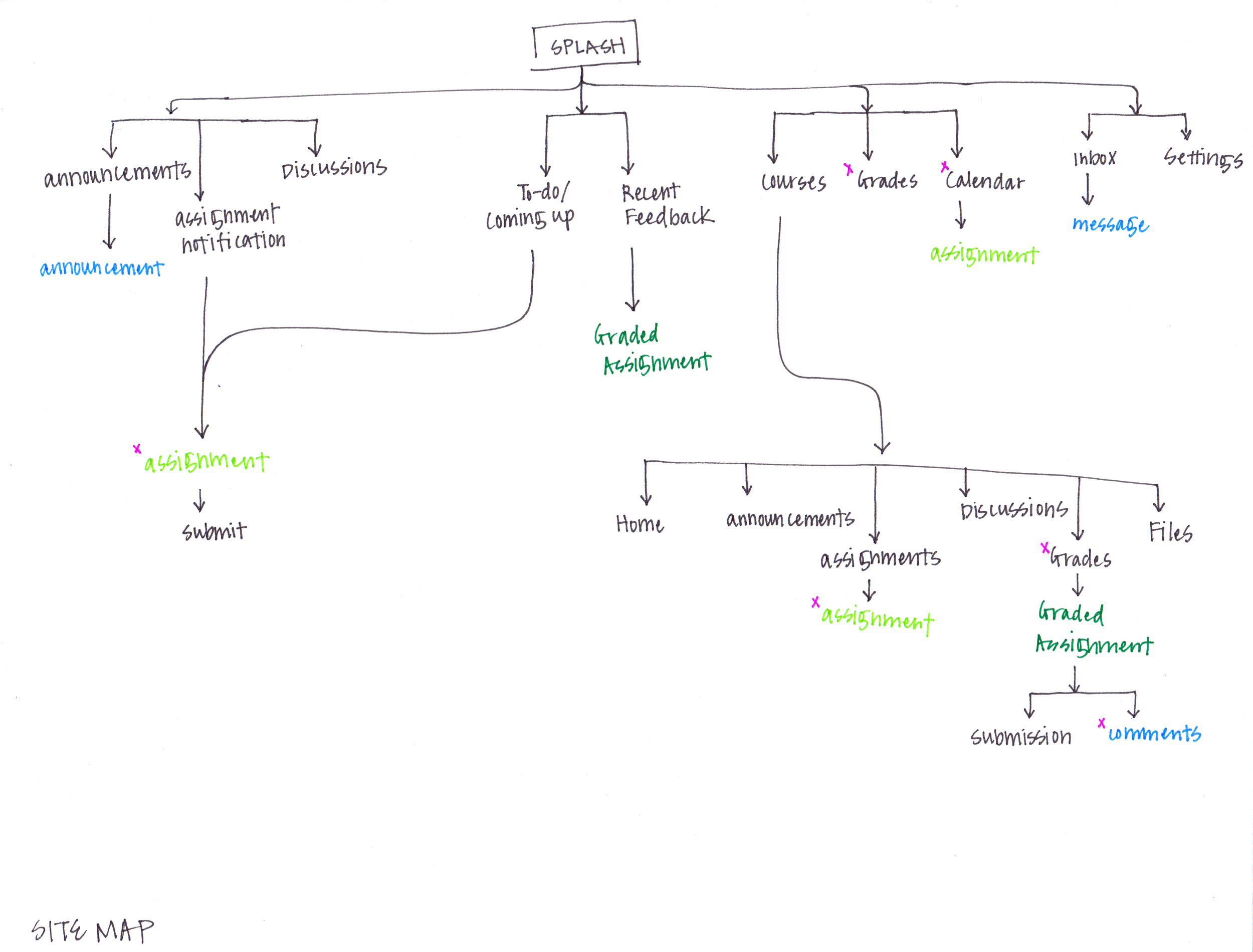
Canvas, the Learning Management System, lacks a good tablet version of their system. It also lacks in functionalities for coordinating group projects, quickly identifying important elements, and easy way to contact professors. With these two focuses in mind, Canvas is redesigned for students to create a more open and social atmosphere.
Time
2 months
Fall, 2014
Contributors
Individual project
Contributions
User research
Ideations / feature identification
Wireframes
Prototype (Hi-Fi)
Usability testing
Tools
Storyboarding tool
Illustrator
Sketch
Solution
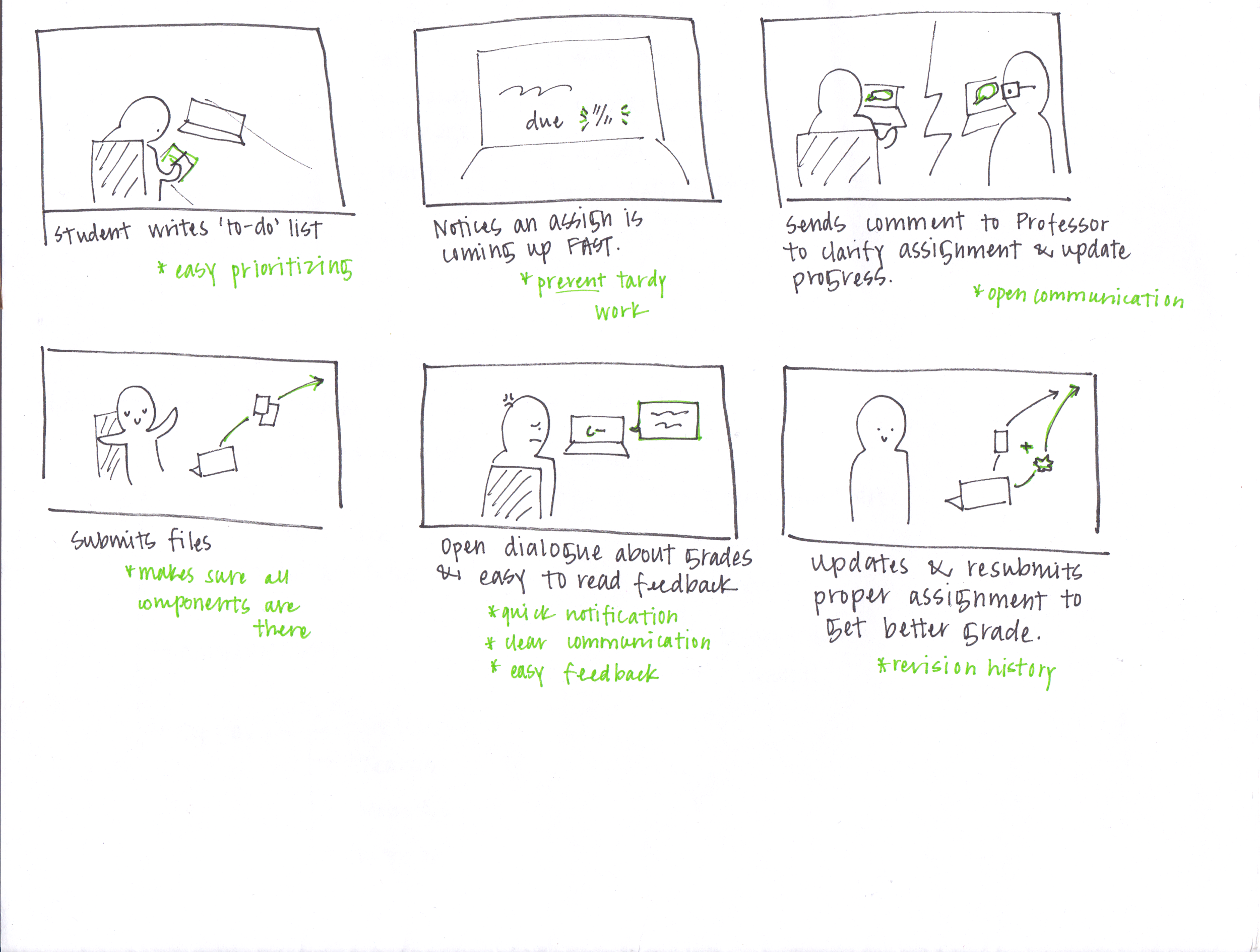
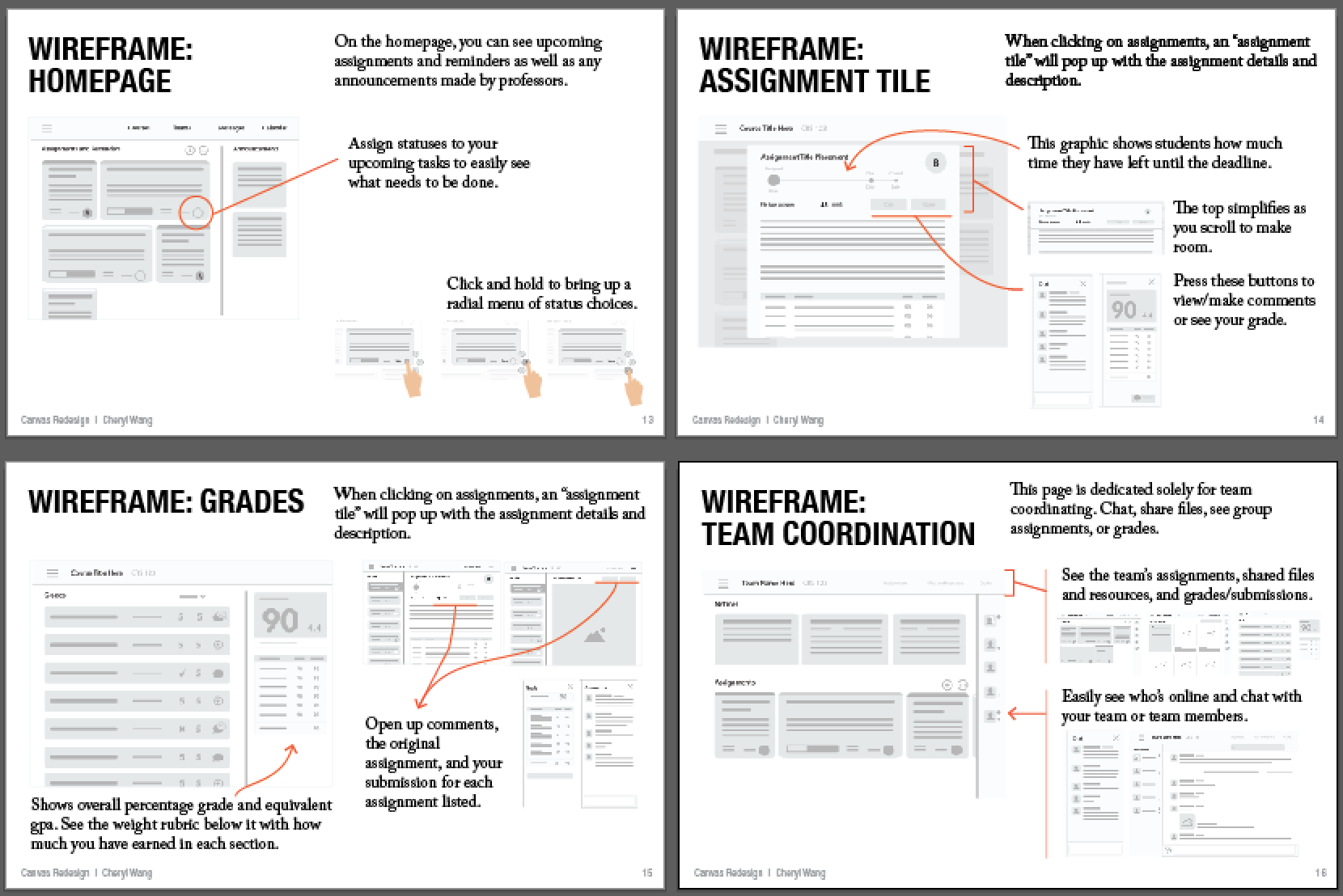
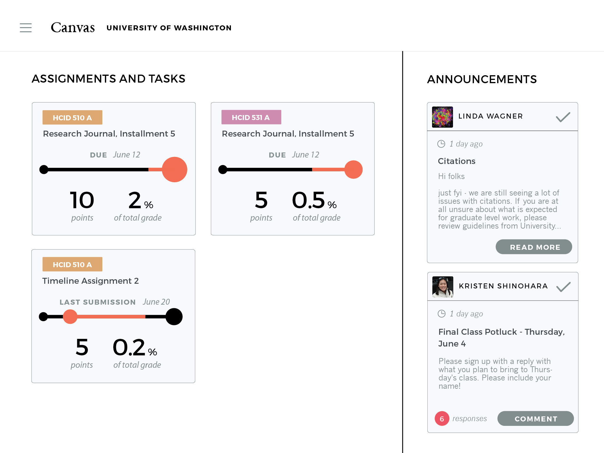
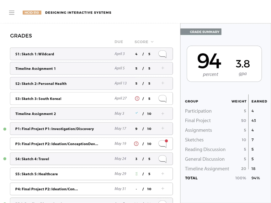
Canvas's new design makes it easier for students to prioritize their assignments and get things in on time. The accordion panels allows students to easily compare important information side by side. At every step, students can easily communicate with instructors.
Tiles
Easily distinguish which assignments matter most.
Announcements are easy to dismiss to reduce clutter.
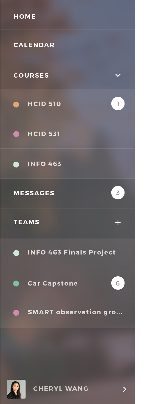
Fast Access
Quickly navigate between courses.
Notifications are obvious and easy to check up on.
Easily communicate with instructors.
Due Date Timeline
See how long an assignment has been up and how close you are to the due date.
Gauge the importance of assignment with the assignment's points and how much it will affect your overall grades.
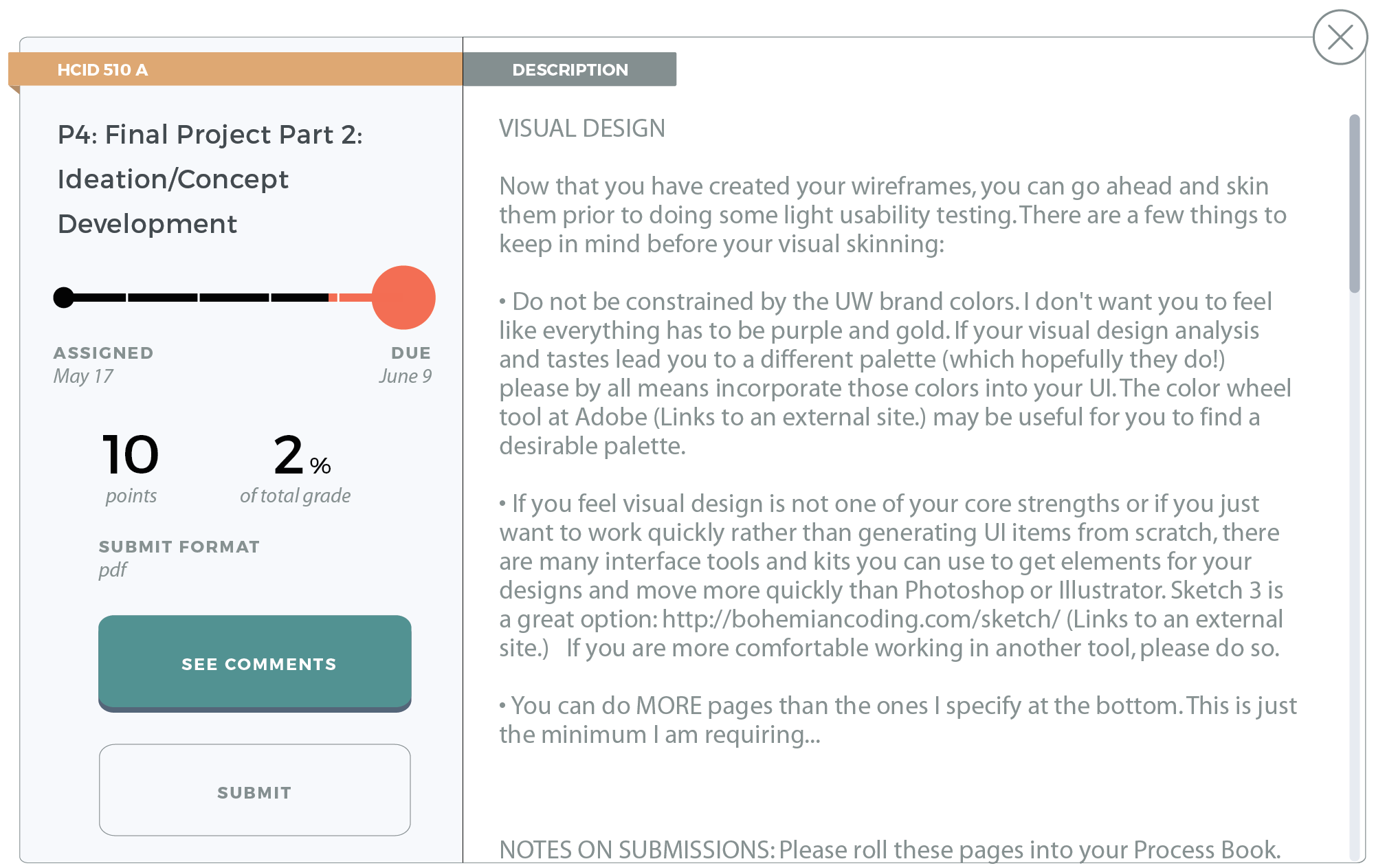
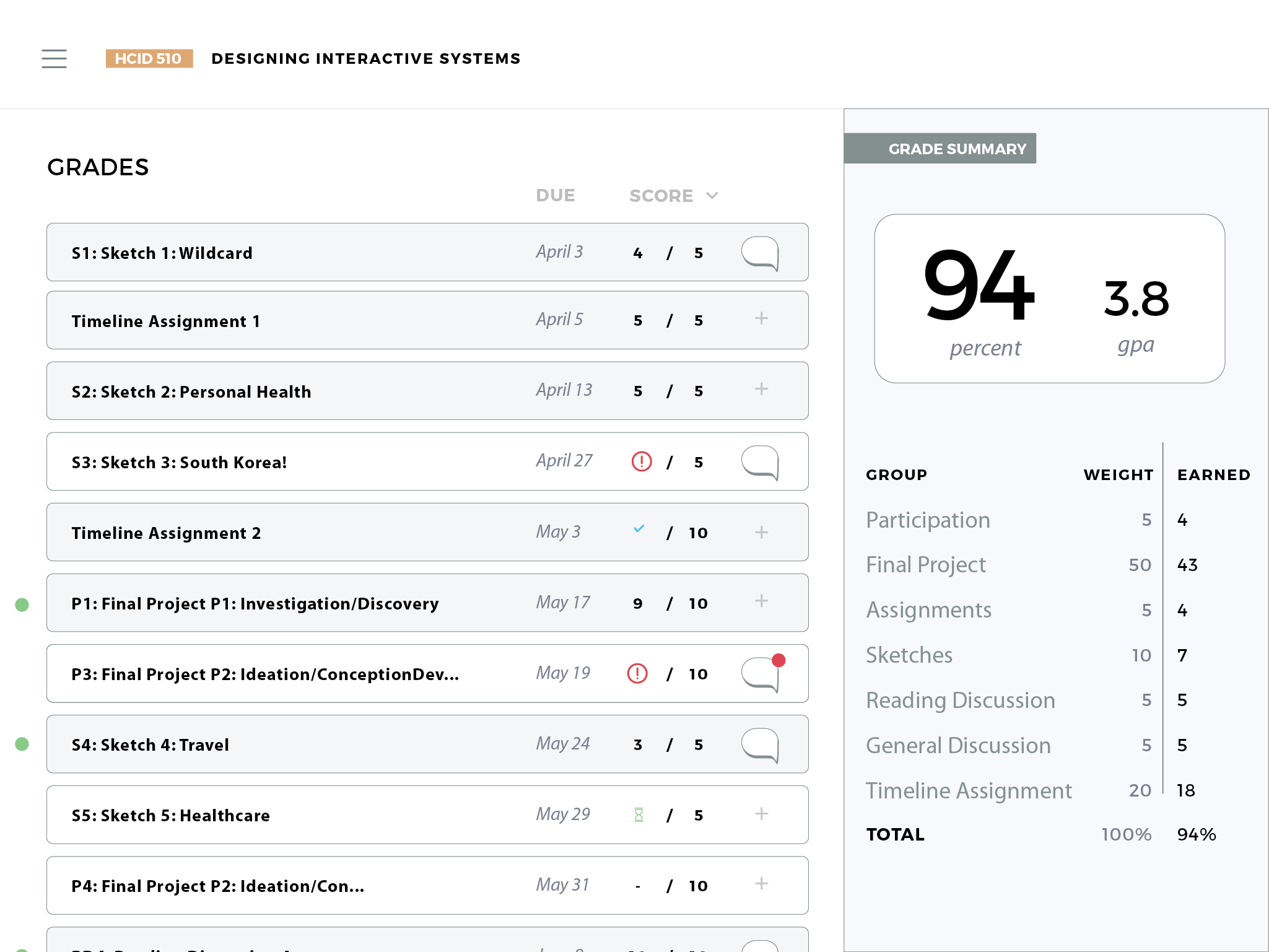
Grade Status
Icons make it easy to see what the status of an assignment is.
Easily contact instructors and comment on assignments.
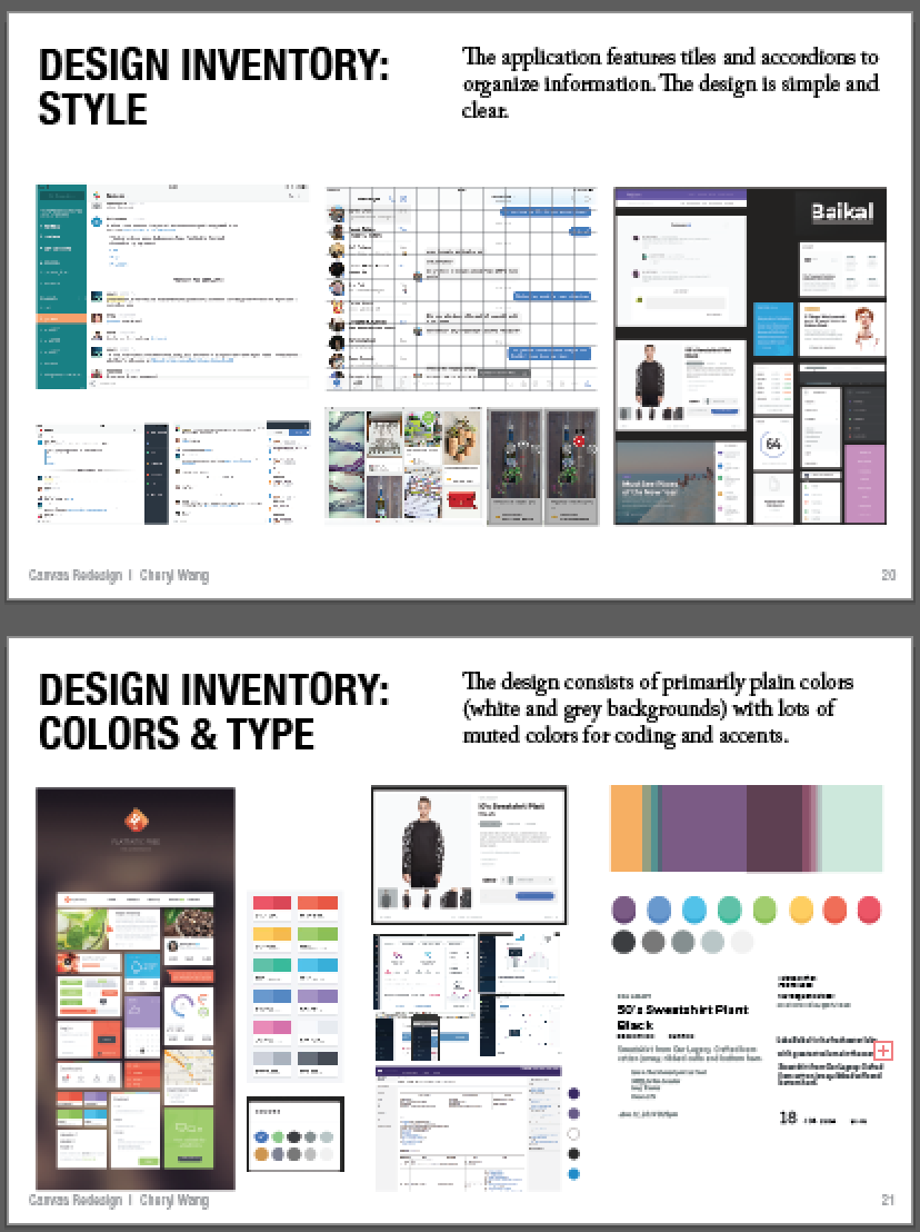
ACCORDION design
The design features accordion style features so it's easy to see important information side by side.
Process
The images below represent work that I took lead on or was actively part of.